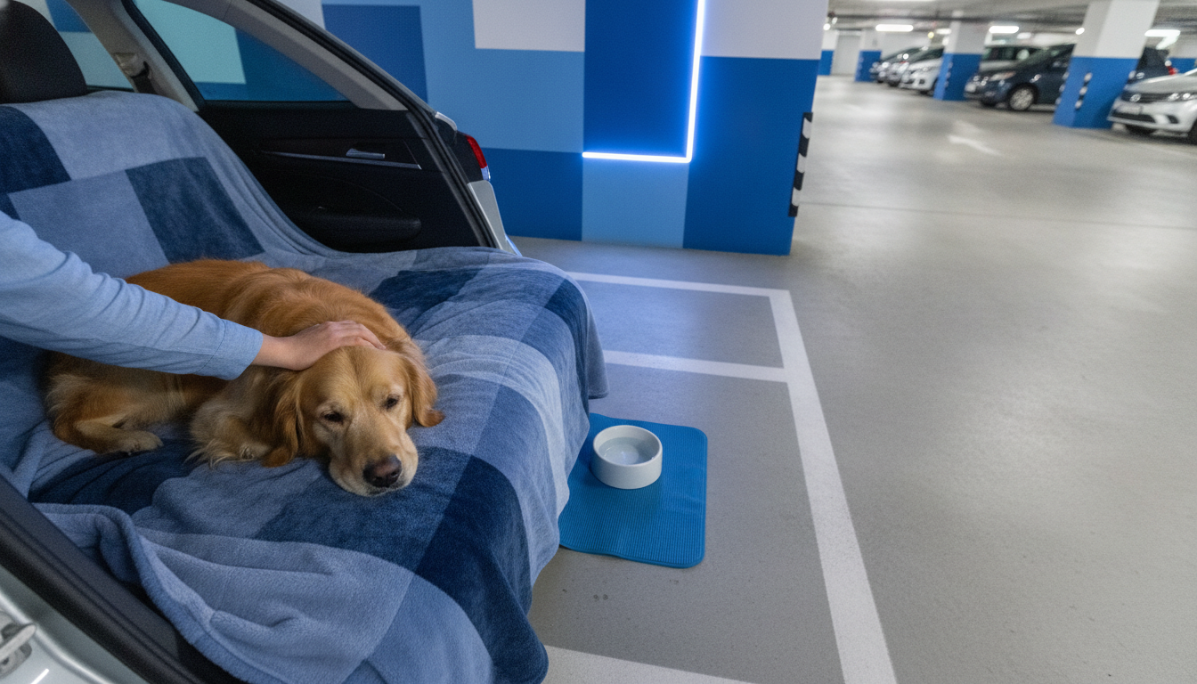
Soft, cool tones tend to be the most calming for many dogs—especially shades of blue. Dogs don’t see color the same way people do; their vision is strongest in the blue and yellow ranges and weaker for reds and some greens. Because of that, a gentle blue can look clear, steady, and low-stimulation to a dog, which may support a more relaxed mood in the right environment.
Blue is commonly recommended because it’s easy on the eyes and reads as a cooler, quieter hue. In practical terms, using muted blue items (like a mat, crate cover, bandana, or wall accent near a resting spot) can help reduce visual intensity—especially compared with bold, high-contrast patterns.
Beyond blue, many owners have good results with soft purples (violet) and gentle, desaturated greens. Even though dogs don’t perceive green the same way humans do, a low-saturation, “dusty” green can still create a calmer-looking space because it avoids harsh contrast and visual “noise.”
Bright, warm tones—like vivid red, neon orange, or intense hot pink—can feel more stimulating in a space because they’re visually loud for humans and often come with high contrast. While color alone won’t determine behavior, choosing calmer, muted tones can be one small piece of an overall soothing setup.
Lighting, clutter, movement, and sound usually have a bigger effect than paint or fabric color. A calm color works best when paired with predictable routines, comfortable temperature, and a quiet resting area. For a deeper breakdown of how dogs perceive different hues and how to apply color choices at home, visit https://elpisa.com/what-color-calms-a-dog-down/.
Most dogs distinguish blues more clearly than greens, so blue often stands out as a simpler, calmer-looking option. If choosing green, aim for a muted, low-contrast shade rather than something bright.







Leave a comment