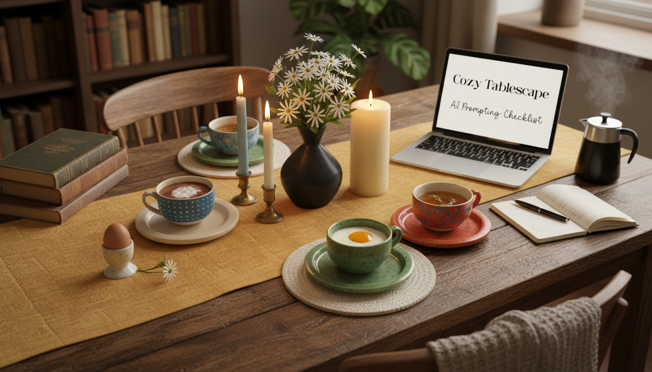
A cozy tablescape is easier to design when each choice is intentional—palette, textures, centerpiece height, place settings, and lighting. A digital checklist turns a seasonal idea into a consistent, photogenic table setting by guiding the details you decide upfront, then giving you quick checks to refine results without starting over. Whether you’re planning a holiday meal, building mood boards for content, or just styling a weeknight table that feels special, a repeatable system makes “cozy” feel effortless.
Cozy table settings share a few reliable traits. When these pieces work together, the table feels calm in person and reads clearly in photos.
The fastest way to get a cohesive set of styled images is to reduce “moving parts.” A checklist helps you lock in the choices that should stay stable, so the table reads like one complete story.
For real-world accuracy, it helps to follow classic place setting structure and spacing guidelines (especially if you’re styling a formal look). The Emily Post Institute’s table setting guide is a reliable reference when you want the result to feel “right” at a glance.
Seasonal styling works best when you pick a palette first, then support it with textures and natural elements. This approach keeps glassware and metallic highlights intentional, so the table doesn’t sparkle in random, chaotic places.
| Season | Palette | Textures | Centerpiece direction | Lighting notes |
|---|---|---|---|---|
| Spring | Soft pastels, fresh greens | Linen, ceramic, clear glass | Tulips, garden blooms, citrus | Daylight + subtle candles |
| Summer | Bright whites, ocean blues, sun-washed neutrals | Rattan, cotton, light wood | Herbs, coastal shells, fruit bowls | Golden-hour warmth, string lights |
| Autumn | Amber, rust, olive, cream | Wood, stoneware, textured napkins | Pumpkins, dried stems, wheat | Warm candles, low contrast |
| Winter | Evergreen, deep red, gold, icy neutrals | Velvet accents, metallics, glass | Pine, ornaments, cranberries | Candle clusters, twinkle lights |
If you want a palette that feels current while staying timeless, use a single “anchor color” and build neutrals around it. For inspiration on trending hues, see Pantone’s Color of the Year, then translate that idea into table-friendly tones (for example, swapping a bold runway shade for a muted linen or a subtle taper candle).
Consistency comes from choosing specifics in a repeatable order. This workflow keeps your results cohesive across multiple images, even when you’re exploring different seasons.
Decide season + occasion + location (indoor dining room, farmhouse kitchen, patio). This anchors the styling decisions that come next.
Rectangular or round; 2, 4, 6, or 8 place settings. Place setting count affects spacing, centerpiece scale, and how “full” the table feels.
Mix finishes for depth: matte stoneware, glossy porcelain, brushed brass, natural wood, and linen napkins are easy to read and photograph well.
Pick one direction: a low runner, a medium floral arrangement, or tall taper candles with minimal greenery. This prevents competing heights.
Choose a clean wall, window light, a neutral kitchen, or a textured wood panel. Busy rooms can work, but only when “collected” is the intentional vibe.
You’ll need a text-to-image tool and a clear concept (season, occasion, and location). A checklist helps you decide palette, materials, viewpoint, and lighting before you generate so the results look intentional.
Yes—consistency comes from keeping the same viewpoint, palette, hero object, and background notes. Reuse the same structure and only swap seasonal elements like florals, foliage, and accent colors.
It’s a downloadable digital file, typically available right after purchase. It’s designed to be reused whenever you want to build a new seasonal table setting concept.





Leave a comment